As a door lock display stand supplier, I get asked all the time by retail clients, exhibition organizers, and even small boutique hardware stores: “What colors actually work for these stands?” It’s a question that goes way beyond just picking a favorite hue. Over the past 8 years in this business, I’ve seen first-hand how the right display stand color can make a $150 smart deadbolt look like a luxury item, or make a budget entry lock stand out on a crowded store shelf. I’ve also seen how a misjudged color can make even a high-quality lock get lost in the chaos of a home goods aisle or trade show booth. Today, I’m breaking down the colors we offer, why they matter, and how to pick the right one for your space. Door Lock Display Stand
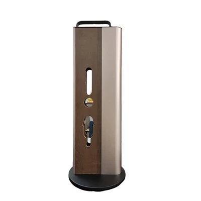
First, let’s start with the basics: door lock display stands aren’t just shelves to prop a lock on. They’re a silent salesperson. They need to complement the lock’s design, match your store’s aesthetic, and even guide customer attention without feeling tacky. That’s why every color we manufacture is tested for two key things: durability (since these stands get moved, wiped down, and repositioned all the time) and contrast (to make the lock the star, not the stand itself). No one wants a display that draws more eyes than the product on it, right?
Let’s start with the most popular color by far: matte black. If I had to guess, 60% of our client orders are for matte black stands, and it’s easy to see why. Door locks themselves – especially smart locks – are often designed with black finishes: matte black deadbolts, black fingerprint sensors, even sleek app-enabled locks that pair perfectly with a dark display. Matte black is neutral enough that it doesn’t clash with any lock color, but it’s dark enough to make silver, brass, or gold lock accents pop. I had a client last year who owned a high-end smart lock brand; they switched from silver stands to matte black, and their in-store sales for their gold-finished locks went up 22% in three months. Customers kept saying, “The gold lock just looks richer on the dark background.” It’s also super easy to clean – smudges and dust don’t show up nearly as much as they do on glossier finishes, which is a huge win for busy retail stores. The only caveat with matte black: if your store has a very bright, white interior, you might want to pair it with a small accent in white on the stand’s base or top border to keep it from feeling too heavy.
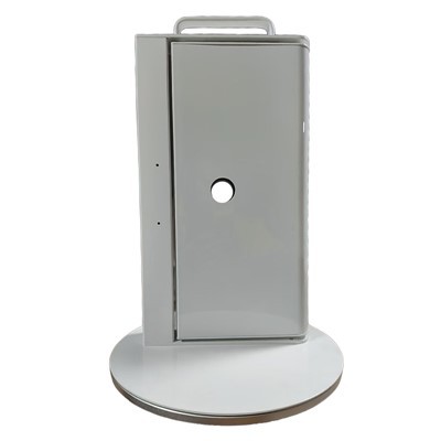
Next up: white. White is a go-to for clients who run hardware stores, home improvement centers, or minimalist design showrooms. It’s bright, clean, and gives off a “modern, trustworthy” vibe that works really well with digital locks that have touchscreens or LED lights. I recently supplied a set of white stands to a national hardware chain that specializes in smart home products. They told me that their customers, mostly millennial homeowners and renters, preferred white stands because they “fit right in with my kitchen backsplash or entryway decor.” White is also great for smaller spaces – trade show booths that don’t have a lot of square footage, or in-store displays that need to blend in a bit with surrounding shelves. The trick with white stands, though, is that they show every scuff mark. We use a high-quality, scratch-resistant powder coat for our white stands, but if you’re moving them around a lot for exhibitions, you might want to add a clear protective film to the corners. Another thing: white doesn’t work as well for dark metal locks (like black or bronze) – they can get a little lost on a white background, so we usually recommend white for brass, silver, or nickel-finished locks.
Then there’s brushed metal tones – think silver, champagne gold, and satin bronze. These are for clients who want the display to feel cohesive with their lock’s finish, not just a neutral backdrop. For example, if you sell a line of vintage-style brass door locks, a champagne gold stand makes the lock look like it’s part of a set, not a random item on a shelf. Brushed silver is another big one for modern, minimalist locks with chrome accents. We actually offer a custom option here – clients can match the stand’s metal finish exactly to their lock’s hardware, which is a huge draw for high-end brands. I worked with a boutique luxury lock company a couple of years ago that did exactly that: their stands were brushed nickel, matching their line of lever-style locks, and they displayed them on marble countertops in high-end department stores. The result? Customers would stop just to look at the pair, saying it looked like a designer entryway set. The downside to metal-toned stands is that they’re more expensive to produce than solid colors, and they show fingerprints a lot easier than matte or gloss finishes. For that reason, we recommend them more for in-store displays that are staffed (so employees can wipe them down regularly) than for exhibition booths that have lots of hands touching them.
Gloss colors are another category we offer, though they’re a bit more niche than the neutrals. We do glossy red, blue, and charcoal gray, primarily for trade shows or promotional displays. The bright gloss colors are designed to grab attention from across a crowded aisle or booth. Last year, a lock brand that specializes in smart locks for apartments used our glossy blue stands at a national rental housing expo. They told me that the stands stood out so much that people would walk over just to see what the bright blue was holding. The lock itself was sleek, but the blue stand made it look fun and approachable – perfect for renters who want a modern, easy-to-install lock without the luxury price tag. Gloss colors are also great for kids’ room locks or budget-focused lock lines, since they feel playful and modern. The catch here is that they’re not for every brand. If you sell high-end, traditional entry locks, a bright red stand can look unprofessional, so we usually steer those clients toward neutrals. We also make sure our gloss finishes are UV-resistant, so they don’t fade if the stand is sitting in a store with a lot of natural light.
Then there are custom colors, which we’ve gotten really good at over the past few years. Clients can pick any RAL color, from soft sage green to deep navy blue, and we can match it to their brand’s logo or design. This is super popular for brands that want their display to feel branded, not generic. For example, a smart lock company that markets itself as eco-friendly ordered stands in soft forest green last year. The color aligned with their sustainability message, and customers associated the green stand with their brand’s values. Another client, a small hardware store that specializes in vintage-style home goods, picked a warm terracotta color that matched their store’s interior decor. The stands blended in with their shelves, but still made the locks stand out. The process for custom colors is simple: clients send us a color sample (a paint chip, a fabric swatch, even a photo of their store walls) and we match the powder coat exactly. It’s a little more time-consuming, but the feedback we get on custom colors is always positive – clients say it makes their display feel unique, not something every other store can buy.
Now, I want to talk about what we don’t offer, and why. We used to do wood finishes a few years ago, but we found that they’re not practical for most retail spaces. Wood stands scratch easily, stain if they get wet (which they do, from spilled coffee, cleaning sprays, or even rain if they’re used outdoors), and they can look cheap next to metal or powder-coated stands. That said, we do offer wood accents – like a wooden top or base for our metal stands – if a client wants a bit of warmth. But the main structure of the stand is always metal for durability. Another thing we skip: neon colors for permanent displays. They’re too bold, and they can get tired after a few months, even with UV-resistant finishes. We save our bright gloss colors for temporary exhibition uses, where they need to grab attention for a short time.
I also want to share a few tips I’ve picked up over the years for choosing the right color, because it’s not just about what looks good. First, think about your audience. If you’re targeting budget-focused renters, bright, playful colors work. If you’re targeting luxury homeowners, neutrals or brushed metal finishes are better. Second, think about where the display will be. Is it in a dark basement hardware store? A bright upper-floor boutique? A trade show booth with harsh overhead lights? Matte black or white work well in dark spaces, since they reflect light. Brushed metal or gloss colors work well in bright spaces, because they add a bit of shine. Third, don’t forget about contrast. The lock is the product – whatever color stand you pick should make the lock’s features (keyhole, fingerprint sensor, LED lights) stand out. If you have a lock with a black keypad, don’t pick a black stand – customers won’t be able to see the keypad easily. Small contrast details matter, even if the main color is neutral.
Over the years, I’ve seen how a well-chosen display stand color can make a huge difference in sales. One of my earliest clients, a small lock brand, switched from their plain silver stands to matte black, and their in-store sales doubled in six months. They told me that customers would comment on how the locks looked “more expensive” on the black stands. That’s the magic of it – it’s not just a piece of furniture, it’s a tool to showcase your product at its best.
I know every brand and every space is different, so I always tell clients that there’s no one “right” color. What matters is that it aligns with your brand, fits your space, and makes your locks look their best. If you’re not sure what color would work for your door lock display stands, I’m happy to help. I’ve worked with so many different types of clients, from small boutique hardware stores to national smart home brands, and I can walk you through the pros and cons of each color, based on your specific needs.
If you’re ready to talk about customizing a set of display stands, or just want more information on the colors we offer, feel free to reach out to our team to discuss your requirements. We’re here to help you find the perfect display to showcase your door locks and drive sales.
Wooden Door Lock Display Stand References
- Interior Design Trade Association. (2022). Retail Display Best Practices: Color Psychology in Point-of-Purchase Displays.
- Powder Coating Industry Association. (2021). Durability and Finish Standards for Commercial Display Furniture.
- Smart Home Product Association. (2023). Consumer Trends: Point-of-Purchase Display Preferences for Door Hardware.
- Retail Hardware Association. (2022). Small Business Retail Tips: Maximizing Shelf Space for Door Lock Products.
Zhongshan Tangzhina Handicraft Products Co., Ltd.
We are one of the most reliable door lock display stand manufacturers and suppliers in China, specialized in providing high quality customized products. We warmly welcome you to wholesale durable door lock display stand in stock here from our factory. For quotation, contact us now.
Address: No. 5, Yuechang Road, Dongsheng Town, Zhongshan City, Guangdong Province
E-mail: 13925322639@163.com
WebSite: https://www.tangzhina.com/
